Tips on Orienting Website Visitors (Get More Conversions and Less Confusion)
August 1, 2018

How well does your website orient visitors so they know they’ve found what they were looking for? The answer may be the key to lower bounce rates and more conversions.
In website design and marketing, we have a number of essential terms we use all the time. Terms like optimization, persuasion, value proposition, and call to action.
We discuss navigation and layout. We analyze images and color use. We spend hours thinking up logo designs and writing clever taglines.
But there’s another equally important concept that often gets overlooked. It’s how well you orient your website visitors.
In fact, the term orientation is rarely used in discussions of websites. Its lack of use often corresponds with high bounce rates and poor conversion metrics. Many sites need to correct this problem.
What is Website Orientation?
Imagine you’re looking for a sushi restaurant in New York. You’re a tourist and you don’t know any of the places in the city. You search for “sushi NYC” and a listing for a top-notch restaurant appears.
You click through to the listing and this is what you see on your screen:

You wonder. Who is this man? Does this place serve Sushi or are they a cigar bar? Where are they? What’s the menu?
The only clue to orient you as a visitor is a link for a reservation.
In practical website design terms, this content does a poor job of orienting a new visitor (In actuality, Masa Takayama is a world-famous Japanese chef, so his image might serve to orient people who know his brand).
When a person clicks from a search results page to a website, it’s like they’re walking into a place they’ve never visited before. Suddenly, they open their eyes and the new space appears.
At this crucial moment, they need orientation, which means they need the content to re-enforce that it’s a match with what they searched for. Furthermore, they simply want to know – right away – that they’re in the right place.
Say, for example, you’re searching for HVAC services in San Antonio, Texas. You click through to this website:
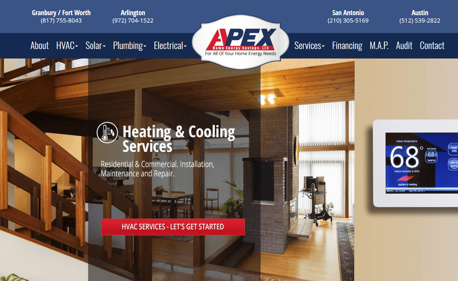
In no more than a couple of seconds, you’re oriented. You can see that they offer HVAC services and that they have an office in San Antonio. The phone number is right there, ready for you to dial.
We’ve talked about this concept before in what we call the 2.5-second rule. In the first 2.5 seconds, your website’s job is not to sell people your offer. It’s not to motivate them to take action or to earn their trust. In fact, you can’t actually accomplish any of those goals in just 2.5 seconds.
The 2.5-second rule is about orientation. It’s content that communicates the fundamentals and answers these questions:
- Does this business offer what I’m looking for? Can they solve my problem?
- Do they offer services in my area? Where are they located?
- What step do I take to engage with this business? How do I contact them?
You must answer those questions in 2.5 seconds so you orient your visitors. When you do, you’re more likely to keep them on your website, giving you the chance to persuade and convert them.
Message Match
Orientation is related to a concept called message match, which we talk about with online ads and landing pages.
Message match means that the message you have in your ad matches the content you present on your landing page.
For example, this ad:

Goes to this landing page:

The call to action in the paid ad is to download a coupon and save. That message is repeated on the landing page where you can easily take that action.
It’s a common mistake with small business advertising to have a paid ad with a specific offer (save 20%, get a free sample, etc.) that clicks through to the website homepage.
The homepage just has the business’ general branding, with no information on the special offer.
This causes disorientation, and you’ve probably experienced it yourself. You click on an ad that details an offer, then go to a landing page and there’s no information about the offer. Where’s the special offer? you ask. If you can’t find it right away, you probably bounce off the site.
Step 1: Orient Site Visitors
Why do so many websites do such a poor job of orienting visitors? Mainly because they overlook it.
Instead, they’re so excited about developing a clever motto or expressing feelings about how much they care about their customers that they forget to put in the functional content visitors need to get oriented.
This functional content is boring…let’s wow them with a clever, original headline instead! And let’s take up space with massive stock photos! We’ll hit them with a big, huge call to action too!
The call to action is fine, but it only works when people understand what you do and where you do it. It only works if visitors get what’s in it for them.
When you use images, make them hero shots that demonstrate the value of your offer in context of use. For example, I’m immediately oriented as to what this business offers just from the image:

Wow people with your offer. Develop a powerful value proposition so people get why you’re a better choice than the competition. Use reviews and testimonials to develop trust.
But first, make sure it’s clear what you do, where you are, and how to contact you. If you have a special offer, make sure you display it and make it easy to redeem.
Disoriented, confused website visitors do not convert. That disorientation occurs the moment they arrive on your site.
Impatient online consumers won’t take the time to figure if you’re right for them. If they’re confused, they’ll just hit the back button and find a different website that orients them right away so there’s no question they’re in the right place.